
AUC (Area Under the Curve) – The Performance-Based Model Selector for Pega Binary Prediction Models
The metrics for binary models is AUC, F-score for categorical models and RMSE for continuous models. The higher the AUC, the better a model is at predicting the outcome. ADM selects features based on their individual univariate performance against the outcome, measured as the area under the curve (AUC) of a ROC graph. By default, the univariate performance threshold is set to 0.52 AUC.
Those statements are copied from the official Pega training documents of PCDS (Pega Certified Data Scientist) exam. AUC is treated as an important performance metrics to select the best Pega Prediction Model and to select the appropriate predictors.
Pega Prediction Models, as the most important part of Pega AI brain, are used in the Pega CDH (for example, to get the churn Propensity, which is the first operand of the famous Pega offer- prioritization formula P*C*V*L.), smart case management, and text analysis.
However, we can’t see the explanations on what and why AUC in the official training documents. As AUC is a very important part of Pega platform, especially in Pega CDH, I would like to share my understanding about the what and why.
- Binary Predictive Model Performance Metrics
We use the result-oriented way to start the journey of what and why.
To predict ONE practical problem, we can build a lot of predictive models based on different algorithms and predictors. It introduces the intrinsic question, which one is the best for us. Performance metrics is introduced to quantify/evaluate those models.
Let’s make a simple example first. You and I make a bet to predict whether the-next-month medium house price in California is higher than current month. It will be very easy to know who will win next month. For example, your prediction is Higher and mine Lower, and the actual next-month price is Higher. Congratulate! you are the winner. The simple metrics used here is to check whether your prediction outcome label (Higher or Lower) is same as the actual one for the just-ONE guess.
Let’s expand the example further to predict 50 states. Assumed the actual result is 20 states higher and 30 states lower. Below are our prediction tables. From the table, I am lazy and predict all as Lower. The red numbers in the table indicate the wrong predictions.

(Table 1)
So, who is the winner for the prediction result? We get the below metrics result from the above table.
- Total Accuracy: I have 30 correct predictions in total (Higher plus Lower), and you have 15+10=25.
- Higher label Accuracy: I am 0% correct for Higher label prediction, and yours 50% correct.
- Lower label Accuracy: I am 100% correct for Lower label prediction, and you have 50%.
Using either 1st or 3rd metrics, I am the winner. However, I will lose if I use the 2nd.
In the example, your prediction logic and mine are two different binary predictive models. Which one is better? It depends on the performance metrics you choose. It looks intuitive to use the 1st metrics instead of the 2nd to judge who is the winner (the best model).
However, it is NOT always true for other situations. For example, Airport security bureau deploys two AI machines(models) to detect suspicious-bomb packages. In the previous example description and table, replace “Lower” to “Good Package”, and “Higher” to “Bomb Package”. Model “I” can’t predict any Bomb package, while Model “You” can detect half. Airport security bureau would prefer models to detect Bomb packages. Now, the 2nd metrics are most likely to be chosen, instead of the 1st one.
Now it is clear. To select the best model as your final model deployed in production, performance metrics need to be set up as a judge first. In Pega AI, AUC is the metrics used to choose the best binary prediction model.
Don’t worry, AUC just expands a little bit for the previous table. The AUC is defined as the area under the ROC curve. So, if we get the idea of ROC, it is just a math integral/sum to get the area under the curve.
- The ROC curves
The Pega official statement of the ROC term is “The receiver operating characteristic (ROC) curve represents the predictive ability of a model by plotting the true positive rate (sensitivity) against the false positive rate (1 – specificity or inverted specificity)”. The statement is not clear enough. We can use the Wikipedia statement, “The ROC curve is created by plotting the true positive rate (TPR) against the false positive rate (FPR) at various threshold settings.”, as a supplement to the Pega, which is adding the Threshold(cut-off) term.
2A. The pair of (FPR, TPR) as a point in the ROC curve
To understand the statement, the key is the terms of TPR, FPR and Threshold(cut-off) setting. Below are the definitions of the TPR and FPR respectively, plus their siblings, TN and FN.
False positive rate (FPR): Probability that a negative is labeled as positive.
True positive rate (TPR): Probability that a positive is labeled as positive.
False negative rate (FNR): Probability that a positive is labeled as negative, i.e. 1-TPR
True negative rate (TNR): Probability that a negative is labeled as negative, i.e. 1-FPR
We can conclude them into the famous confusion table as below, which is an abstract version of our previous concrete example table.

(Table 2)
Let’s expand the previous example table below to calculate FPR/TPR. We will treat the “Higher” label as Positive, and “Lower” as Negative. The “(P)” in the table is indicated as Positive, and “(N)” as Negative.

(Table 3)
So, it is easy to understand why we use both FPR and TPR, instead of either one to form our AUC metrics. Although there are 4 numbers/cells in the table, only 2 cells are variables when the total of Positive and total of Negative are known. That means the table has 2 degrees of freedom and 2 out of four numbers can be freely chosen. When you input one cell in the first row and one cell in the 2nd row, the remaining two cells can be deduced from the two input cells, and the whole tables are defined. TPR and FPR are the extension versions of the two variables. We can use the TPR and FPR to represent the whole table. But either one can’t represent the whole table. As ROC is plotted by (TPR, FPR) pair, the area of under ROC, i.e. AUC, can be used as a metrics to represent the model.
This explanation is intuitive from the table. Actually, the pair are major terms in statistics theory. In statistics hypothesis, type I error is equivalent to a FPR, and a type II error is equivalent to a false negative rate, which is 1-TPR (https://en.wikipedia.org/wiki/Type_I_and_type_II_errors). So, AUC also has significant meaning from the statistics view, as it cares for both Type I error and Type II error.
The table shows the (FPR, TPR) pair, (0.5,0.5) and (0,0), for Model “You” and Model “I” accordingly. That is one point in your ROC curve and mine respectively.
2B. One Threshold to generate one pair (FPR, TPR)
We have one point now in the Cartesian coordinate(x,y) system. That is a good start to plot ROC. How does a point become a curve? We need to introduce the term Threshold for that. To use threshold in models, predictive models need to generate continuous scores, such as probability, instead of just a label, such as Positive or Negative.
So, let’s have a brief look at Pega predictive models. Below two statements are copied from Pega training documents.
You can create 4 types of models: Regression models, Decision tree models, Bivariate models and Genetic algorithm models.
By default, a Regression and a Decision tree model are automatically created. These models are highly transparent.
Traditional Decision tree model can be treated as a discrete classifier model, which may only produce a class label by using the most prevalent one from test instances results. However, it can be easy to transform a label to a continuous score, i.e. the probability of each label, by using the training data statistics result. For example, from the decision tree root to a leaf, i.e. one full decision path, the training data will show the total Positive instances and the total Negative instances. The ratio of Positive instances and Negative instances can be treated as the score for the prediction.
Regression models for binary classification, such as the Logit Regression model, have already provided score/probability output for each test/predict instance.
Now both of these two default Pega computation models generate a continuous probability, i.e. propensity in Pega term, in the prediction output, instead of just the label output. In our house prediction example, the output now will be the probability of the Higher label. For example, the probability of CA house price Higher than the prior month is 0.8. Below is a sample prediction output for the house price example.

(Table 4)
The above table uses the probability threshold to generate a prediction label for the states. For example, For AL state prediction, the probability of higher than prior month generated by a predictive model is 0.6. If the threshold is set as 0.5 or 0.6, it will be labeled as Higher. However, it will be labeled as Lower if set to 0.7. When compared to AL state’s Actual Label, Higher, it will count as TP for threshold 0.5 and 0.6. But it will count as FN for threshold 0.7. Below is an example from Amazon AI public document on how threshold change the TP and FP.

Now, each threshold setting is treated as one classifier, and will produce one the concrete famous confusion table with the relevant (FPR, TPR) pair. With all available appropriate threshold settings, we will generate many confusion tables with pairs of (FPR, TPR). Those pairs form the ROC curve. Below is an example ROC picture from Wikipedia.

(Figure 2)
2C. The ROC usages
ROC curve provides us a convenient visualizing plot to choose classifiers (i.e. the points in the curve) with tradeoffs between benefits (true positives) and costs (false positives). In the Airport security “Bomb Package” detection example, we will get benefit (less casualty and less airplane damage) if we can detect most of bombs with lower threshold. However, according to Figure 1, a lower threshold will generate more false alarms with more cost (i.e. more human effort to check those good packages).
Another usage is to generate new classifier (i.e. Interpolating classifiers) if existing classifiers (points) in the ROC can’t match requirements. You may google “Interpolating classifiers” for more detail. As it is out of our scope, we will not discuss it here.
- The AUC metrics
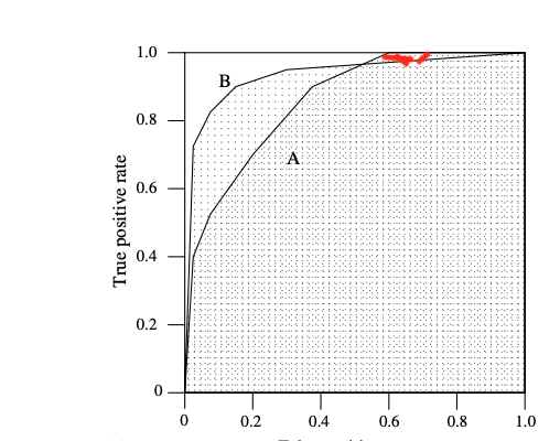
Finally, we are reaching our destination, the AUC metrics. ROC is a curve with pairs of (FPR, TPR) for different classifiers/thresholds. It is not so convenient to compare the performance of two predictive models. Area Under the ROC curve, i.e. AUC (a single scalar real number), is introduced as the average performance of a predictive model. As Pega doc mentions at the beginning, “The higher the AUC, the better a model is at predicting the outcome”. This is correct for general/summarized performance of two models. However, for specific zone, higher-performance AUC models may have worse performance than lower -performance AUC models. Below figure is the example. The model B has higher AUC (area) than model A. However, in the red upper zone, model A has better TPR than model B with the same FPR.
- Note on writing the article.
As the topic is a little bit theory-level oriented. I have tried my best to correct my errors for the article. But I am not sure whether any error is still there.
I thought it would be easy to write this article after I passed the PCDS exam. However, it took me 3 days to finish it after reading lots of other researchers’ documents. It is a good summary/journey for my understanding about AUC. Hope it will help you also.
Related News
AUC (Area Under the Curve) – The Performance-Based Model Selector for Pega Binary Prediction Models
The metrics for binary models is AUC, F-score for categorical models and RMSE for continuousRead More
......Pega Certified Exam for Decisioning Consultant & Data Scientist (PCDC, PCDS)
Within two-month study (Oct and Nov, 2022), I passed the PCDC exam and the PCDSRead More
......